Some thoughts about colour in Paul Thomas Anderson’s Punch-Drunk Love, inspired by The Language of Hollywood: Storytelling, Sound and Colour.
Punch-Drunk Love, Paul Thomas Anderson’s surrealist-tinged rom-com, is a celebration of colour, conveying emotions through a tightly controlled colour palette, abstract colour sequences (created by digital artist Jeremy Blake) and carefully considered cinematography techniques. Like Douglas Sirk before him, Anderson opted for an unusual genre with which to experiment with colour. Rom-com’s are the ultimate in ‘does-what-it-says-on-the-tin’ entertainment, as a result their tried and tested formulas are ripe for innovation. The story that’s told, and the emotions that are conveyed, are so familiar to audiences that they don’t have to work too hard to ‘understand’ or ‘feel’ the concepts, experimental techniques don’t distract from the overall experience.

One of the most obvious uses of colour experimentation in Punch-Drunk Love are Blake’s digital artworks, colourful swirls that ebb and flow and act as a punctuation point between acts. Each incidental is overlaid with sound and snippets of dialogue that are pulled from other sections of the film. On a purely visual level they recall the riotous colour-scapes of Busby Berkeley, but unlike Berkeley, they function more as a celebration of the aesthete. As well as being visually pleasing, the incidentals force the audience to focus on colour, they become more sensitive to its use in the rest of the film and notice colour subtleties more keenly; handy considering that elsewhere in the film Anderson has plenty more colour stories to tell.
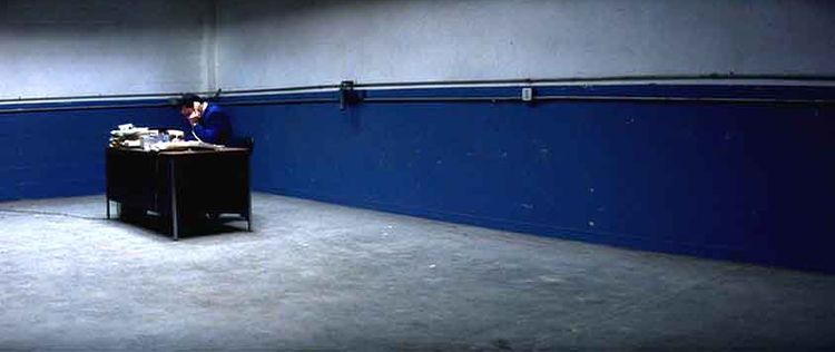
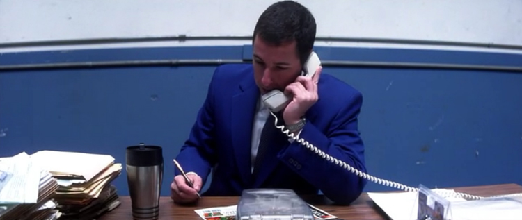
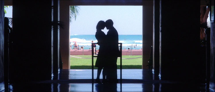
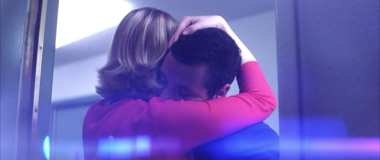
The opening scene of Punch-Drunk Love introduces two key themes. Barry Egan (played by Adam Sandler) is seated at his desk, and is talking on the phone. His blue suit is perfectly coordinated with the blue section of the wall behind him. This visually places Barry in his surroundings; he is at home here, this is where he feels most comfortable. The visual device also splits the scene into three horizontal stripes: the floor, then a blue and white section of wall. This visual motif is repeated time and time again, but always with subtle variations. When he leaves his office, the stripes change – road, building and sky. This strong geometric image creates a sense of order and control, and speaks volumes about Barry, his life and his personality. It’s repeated time and time again, for emphasis, but also to tie the scenes of the film together: when Barry and Lena (Emily Watson) embrace in Hawaii, their silhouettes are framed by the door through which you can see beach, sea and sky.
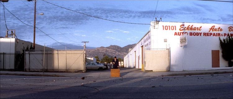
According to David Bordwell (Poetics of Cinema), this idea is part of a stylistic trend known as the planimetric image. The ‘shot is framed perpendicular to a back wall or ground, with figures caught in frontal or profile positions, as in police mug shots’. Bordwell suggests that this first became popular in the 1960s (coinciding with the reliance on long lens shots); if Anderson was looking to Sirk and earlier filmmakers in Punch-Drunk Love, this association makes perfect sense. The effect of planimetrics is to create more abstract configurations and to isolate characters; for Anderson it’s an effective way to reiterate Barry’s loneliness. Other visual clues continue this theme; in a later scene at a family party his portrait hangs on a different wall to the rest of the family’s.
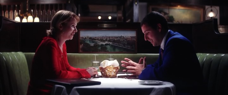
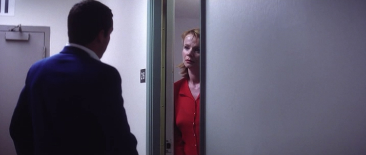
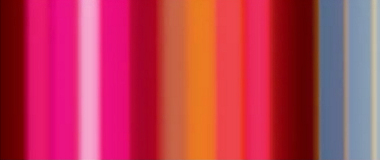
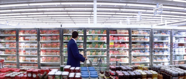
Anderson also successfully introduces a tight colour palette, although to say that the colours are symbolic (red means love or anger, blue for sadness and so on) seems to be playing down the effect the colour restrictions create. Red, white and blue hues (with a dash of green thrown in for good measure), dominate the film. As mentioned, Barry’s blue suit matches his workplace. Lena’s first costume is red, and her car is white. On their first date Barry’s red tie coordinates with her red outfit, which is accented by the green of the restaurant booth. In the climax, when he goes to her flat to apologise, the same palette is used – his suit (blue), her outfit (red), the walls (white) and the doorframe (green). The colour palette also works from frame to frame. When Barry rushes to Hawaii, a red truck outside his work perfectly matches the uniforms the stewardesses are wearing at the airport.
The enforced colour palette draws attention to that which falls outside it. Barry and Lena are clearly meant to be together – not because she wears the same colours as him (although her reds to become more blue toned as the film progresses) but because everyone and everything else (his family, for example) are so outside of it. Quite simply, they’re in a different world.
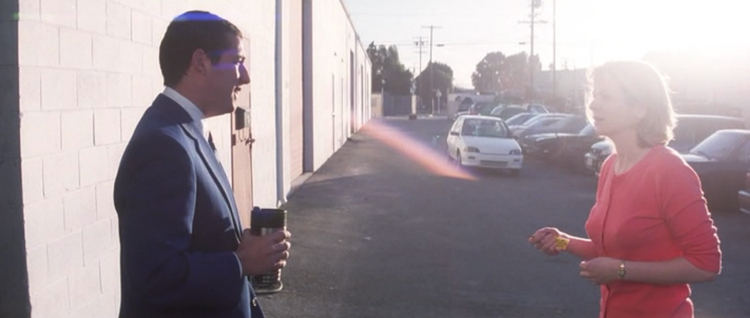
One final colour experimentation, used to effect, are cinematographer Robert Elswit’s lens flares. These deliberate ellipses of light also come in blue and red, are often marked by a score on the soundtrack and are used to highlight key moments or important events. They also add a sense of otherworldliness and unreality to the film; the city and Barry’s workplace appear more beautiful than it actually are. It’s all part of the ‘romance’.
Ultimately, Punch-Drunk Love is a successful movie because of Anderson’s colour experimentations, which elevate the rom-com above the everyday. Grounded in the everyday, the film has just the right amount of quirkiness, and never strays into cliche or stereotypes. Barry is inarticulate, filled with rage and unsaid emotions. Everything he struggles to express is communicated by the ‘world’ that Anderson creates, the audience is aware of what Barry needs and should do, but it’s not until he works it out that his life and accepts that he has fallen in love that it all slots into place. Although it’s easy to read the director’s visual clues from a purely symbolic angle they are more subtle than that. In fact they don’t really ask the audience anything, other than to observe, understand and absorb Barry’s world and its unexplainable peculiarities. Perhaps this is Hollywood at its most powerful: when it stops an audience from thinking and just asks them to feel.

This is crisp and lovely film-writing. You set up your closing line beautifully, “Perhaps this is Hollywood at its most powerful: when it stops an audience from thinking and just asks them to feel.” I appreciate your explanation of “planemetric” and the connection to Sirk’s use of composition and color.